
You are currently browsing the tag archive for the ‘Decorating’ tag.
Ok, so that statement isn’t entirely true. I still love yellow and want to wear yellow sweaters while I carry my yellow purse and although I’m still searching for yellow shoes, I will find them, and wear them with all my other yellow things while wearing my yellow necklace. BUT…my yellow lamps are not bringing the sunshine into my living room like I had hoped. I don’t know if it was the shade of yellow or perhaps the finish but they were lack luster to say the least. So I made an executive decision to sand them and go white. Bright glossy white. I know it seems boring but I’m coming to terms with the fact that I’m kind of boring. I like the neutral wall color in our living room and kitchen, the earth tones of the rug and curtain, the white trim, and dark woods. Boring, yes…makes me happy…YES! So I’m embracing my boring and going white. You also know that I change my mind on a daily basis when it comes to design decisions so if my darling thrift store lamps are neutral then they will always coordinate with the rest of the room or any room if I choose to move them around. I need that sort of flexibility in life desperately because let me tell you, sanding these suckers has been a nightmare.

First off, let me just air my dirty laundry. I primed these brass beauties before applying the yellow paint and for some reason the primer left a sort of rough texture. Did I do anything about it? No. So I ended up with sandpapery yellow lamps and I just chose to live with it. Poor decision. Now that I want a smooth glossy white finish, I have to sand the lamp down to be super super smooth. This is annoying and makes me cranky. Husband laughs at me because he sands on a daily basis and he has to be much more tedious and detail oriented and on a much larger scale. He is quite the one-upper sometimes (love you babe!). Ok, I can’t beat him when it comes to complaining but thats not going to stop me. Sanding lamps with bumpy primer texture stinks and it almost makes me just want to have one lamp in the living room and just trash the other because I don’t want to sand it.
Ok, Well I sucked it up and did both because I just couldn’t bare to fail again!

After getting my lamps sanded down, I taped up the electrical portions and got my glossy white spray paint ready go. Thats how we ended up with this!
 I love them and they make me happy. However, as you very well know, I reserve the right to change my mind at any point. 🙂
Back in the big bookcase reveal, I shared with you a few pics of our accessories at the time. I had picked up a few unique items at our local antique mall, Sleepy Poet; including an antique block planer, artillery box, and brass duck heads.

I’ve been struggling with the brass duck heads since I bought them. Not struggling with whether or not I liked them (I love them actually) but what to do with them. Should they stay brass, should I paint them white? These are the important questions that plague me at night :). Well I finally decided to paint them because the brass just wasn’t cutting it. And what did I decide on…blue! Seems odd I know but as I observed the other “things” on the bookcase, I noticed that I already had a blue theme going and I didn’t even know it. Blue vase, blue door photograph. So I grabbed a can of Valspar gloss spray paint in Royal Blue and went to town. A perfect super quick project to complete in between episodes of America’s Next Top Model a really intellectual documentary.


Obviously, the styling of a bookcase is quite the process and evolution but I’m starting to like the direction it’s going. I’m focusing on found objects and meaningful things from our life together. The one thing that really needs to be addressed is the light in the hallway. I can never get a good picture because the lighting is horrible and I always end up having to use the flash. Boo! I’m thinking I might create a similar fixture as the one in the kitchen. Thoughts?
So last weekend, we made a little update here at the Gillen house. I have long hated the color of my bedroom.

I mean what was I thinking! It’s all pastel and gross and looks like it belongs in one of those girl’s nurseries that I hate. So not me and definitely not representative of our style. I have had my heart set on a charcoal gray bedroom for a few months now and after getting the hubby on board, I bit the bullet and bought the paint. Martha Stewart Zinc.
Let me start by telling you how much I am in love with Lowe’s paint. I won’t buy paint anywhere else. Naturally they matched the Martha Stewart color which is only carried at Home Depot but on top of that they offer a “flat enamel” paint. I have now painted every room, except the guest room, in this type of paint. It is a flat finish but has the characteristics of an eggshell or satin. It can easily be touched up but can also be wiped down. Love it! I can’t stand any paint with a sheen. It kind of makes me want to gag so it’s flat all the way for me. I’m also a compulsive toucher-upper so that feature is a must. But when it comes to kitchens and bathrooms, you really need the wipeability…is that even a word? Anyway, Valspar Flat Enamel has all that and I’m officially sold.
Ok, back to the bedroom. We picked up our Martha Stewart, Zinc in Valspar Flat Enamel and headed home. After an afternoon of painting, only 2 coats necessary, we ended up with this!


I am in love. It’s so sophisticated and I love the deep color for a bedroom. Very relaxing. Now I’m starting to see a little cohesion in our house. Now if I could just tackle the guest room…
Obviously our bedroom still needs some sprucing up. We have big plans for the wardrobes, windows, and bed so stay tuned! It’s one of many things on our to-do list!
So I decided to start a regularly scheduled post each week that will include one image that I am obsessed with…at least for the moment. I’m hoping that this will do two things: (1) make me post at least once every week (I know, I know…I’ve been pretty slack lately) and (2) share some inspirational things I stumble upon. As all of you know by now, my likes and dislikes change on a daily basis so this could get a little crazy!
Now for week 1.

I stumbled on to this photo while I was flipping through the latest issue of House Beautiful. Now normally I wouldn’t give it a second thought because the Ikat fabric makes me want to puke but my eye was immediately drawn to the yellow woodgrain fabric covered bench. Um…hello. Did you hear me?! Yellow woodgrain fabric! I must have this. I don’t know where. Pillows, headboard, side chair! To give you a little more information about the photo, all the fabrics are from Kravet Fabrics new collection by Thom Filicia. Yep, thats right. The Queer Eye for the Straight Guy dude. Apparently he’s doing well.

I love this fabric. Maybe it’s just that the Gillen house is obsessed with all things made of wood. What do you think? Love or hate?
As you recently read here, Wes and I revamped the living room with a fresh coat of paint, a new rug and a pair of new curtains. With those key pieces in place, I started to reevaluate the other elements in the room. Specifically our coffee table choice. We currently have this cherry & maple table that Wes handcrafted.

Now this is a beautiful table but the cherry wood tone doesn’t quite jive with the other darker wood tones in the room. As I’m gradually defining the look and style of the room, I’m starting to consider more non-traditional options.
I saw this concept while doing some aimless googling one day.
I was instantly in love! In an 800 SF bungalow, you are constantly on the look out for storage and OH the storage this beauty would provide. The clincher is that it really needs to be a vintage piece to really achieve the right look. A brand new flat file won’t quite do the job. You have to have the chipped paint and rust to give it character and a few original label holders on the drawers wouldn’t hurt either. I’ve been on the look out for quite some time and haven’t found one yet. I’m sure if I wasn’t looking for one, I would find a whole store devoted to vintage flat files. I’m considering getting a brand new one (free from work) and making it look old myself. Thoughts on that? Not quite sure how to do that but I’m sure a little Google search couldn’t hurt.
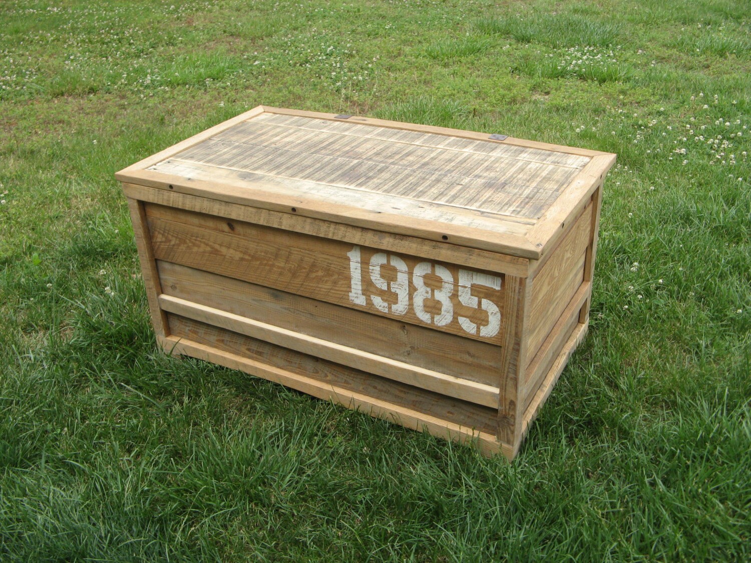
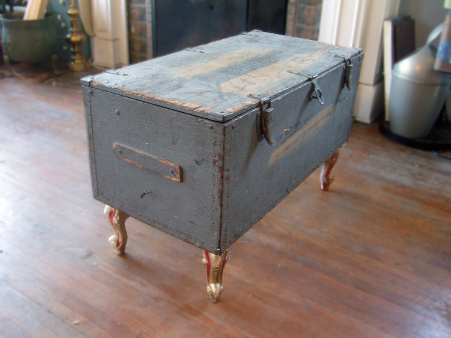
My other consideration is a vintage trunk. I know, I know. This has been done to death but there is something so intriguing about a gently worn trunk with a story. No trunk is the same and I love that! Again, the additional storage wouldn’t hurt either. These are a few different takes (not the standard leather with brass hardware) on the vintage trunk that could be interesting.
 Then there is the pallet. Unconventional, yes, but the options are limitless. I stumbled upon this idea after seeing this high price beauty in a pottery barn catalog.

I love the vintagey feel and those wheels! I immediately thought…”Wes can build that!” So I started my internet search and found images of all these amazing interpretations of the pallet coffee table.


So there are my thoughts. I can’t quite decide which is my favorite. Feel free to chime in with your opinion!
I recently got the itch to update our bedroom duvet cover. I love what we have now but as you all know, this girl likes to switch it up. Currently we have this amazing paisley number from Crate & Barrel that we received as a wedding gift.
I started a major google search over the weekend and honestly I’m just a bit torn between these two. Which would you choose?


*images courtesy of www.amazon.com
HA HA!! Ok, in all seriousness, I am having the hardest time tracking down anything that I like. I stumbled upon this duvet during a random google search and do you know what I discovered…

This bad boy costs $723.00 for a king size. And NO, that is not a typo. We can cross that one of the list.
Then I contemplated this mosaic duvet from Crate & Barrel.
I think this one has a lot of potential but I will definitely need to check it out in person to see how vibrant the colors are.
Well enough about me and what I think. What are your thoughts? Have you seen any amazing bedding lately or perhaps you have an opinion on one of the options above or have experience sticker shock like I did from the $700 price tag for a simple duvet. Let it all out. I’m all ears!
If my three avid readers have learned anything over the past month or so, it is that I change my mind. A lot. And I change it quicker than a celebrity can say I do and then sign the divorce papers. This being said, I can certainly defend my constant indecisiveness. It’s because I like too many things, too many styles, and too many ideas. As soon as I feel satisfied with one plan, I see a picture in magazine or a new product online and the day dreaming starts all over again. Our living room is a perfect example of this.
Remember this plan?

I loved it and I thought it was the one! Well I still love it but something else caught my eye along the way. I started having visions. Visions of gray walls, warm woods, and graphic patterned curtains. I have always had my eye on these curtains at IKEA.

So I revisited the idea of these curtains again and decided to bite the bullet. Thats right, I bought them! Now if you know me then you know that this rarely ever happens because I assume I will grow tired of the idea before the cashier can hand me the receipt. This time was different though. I have loved these curtains for months and months and they seemed like the perfect place to kick off the design. They provided a beautiful palette of army greens, rich browns, and gray blues. Also this palette would work with some existing pieces. We certainly plan on replacing our sofa in the near future but the green in the curtains actually coordinates perfectly with our existing hand me down.
With the curtains in hand, the next step was the paint color. We made our traditional trip to Home Depot one Saturday and pulled samples of every warm gray we could find. We finally settled on Glidden Wood Smoke which a co-worker of mine also happened to use in a recent commercial project and highly recommended it. Sold!
Last but not least came the rug. Since the curtains were bold and the focal point of the room, I wanted to tone down the rug. I started doing my research and developed a new infatuation with natural fiber rugs. They are super durable and just require a little vacuuming to keep them looking sharp. With two large dogs and a small living room, durability is key. With that idea in my pocket, I visited my local West Elm. Thats where the clouds parted and the angels started singing. I found this beauty and let me tell you, the website photograph does not do it justice.

The large overscale diamond pattern in the deep charcoal gray is breathtaking and really adds something special to a traditional braided jute rug. I really wanted the rug to have personality of its own so that the curtains didn’t overshadow it but instead they worked together for a more layered look.
Now that I have broken down the pieces of the room, lets get to the big picture…literally.

Obviously some accessorizing stil needs to take place but Wes and I are both in love with the new look. And Bailey too. Can’t you tell she is just overwhelmed with excitement about the new rug she gets to lay on?!
It doesn’t stop there though. I haven’t properly introduced the blog world to the other corners of the living room so now seems like the perfect time. Readers, meet the living room. Living room, meet the readers.

*Yes that is Gilmore Girls on the television.* This is the awkward wall that you walk right into as you enter the front door. We had the hardest time trying to figure out what to put here. Art never seemed quite right jammed up against the television and then a lovely friend of mine suggested shelving. Of course! Why hadn’t I thought of that?! Luckily I have brilliant and create friends. So after a quick sketch in my sketchbook, the hubs whipped these shelves up one Saturday afternoon and began the daunting task of accessorizing. Side note: The hubby also built the TV unit.

This is our lovely little hallway leading to the bookcase you saw here. We try our best to really personalize the art in our house. The best way we have found to do this is to incorporate vacation photographs. We don’t care to have our faces plastered all over the house but take a few architectural photographs or landscapes, have then printed in a sepia tone, and BAM! you have art. I love grouping smaller photographs together for bigger impact so thats what I did here. These are all photographs from our trip to Portland, Oregon last year. We have beach, mountain, and city all in one.

I also had a bunch of frames leftover from our wedding photo gallery so I just spray painted them all white for a more cohesive look. I love that they look so professional but have special meaning for our family.

And here is our dining corner. Talk about a multi-tasking room! This table and chairs set was a lovely wedding gift as well as the threesome of mirrors on the wall. This corner might be my favorite in the whole house. The artsy light fixture over the table and the quaint table for four that actually unfolds and can seat up to 8!
Hello?! Are you still there?! Sorry for the long post but I am loving my living room right now and wanted to share the goods. I’m also excited that I finally committed to a design and stuck with it. This might be a first. The next project is to interject some pops of yellow for a little surprise and fun. Stay tuned for more details on my DIY ideas for that!
While Wes and I are in the process of tying all the loose ends in the bathroom, I thought I would interject with a post about ME!
I have a problem. A design problem none-the-less- but still a problem. I can’t focus and this is a focus that can’t be solved with a little ridilin. I have Design A.D.D. I define Design ADD as an inability to decide on one particular style for your home and commit to it. I have been battling this problem since Day 1 in our lovely little bungalow. The main source of confusion for me…the living room. The living room is such an important part of a home. Its where most families (ok, well at least ours) spends most of their time. Thats where we brainstorm DIY projects, watch movies (lots of movies!) and spend time with our pups. If the living room doesn’t feel like home then no where does.
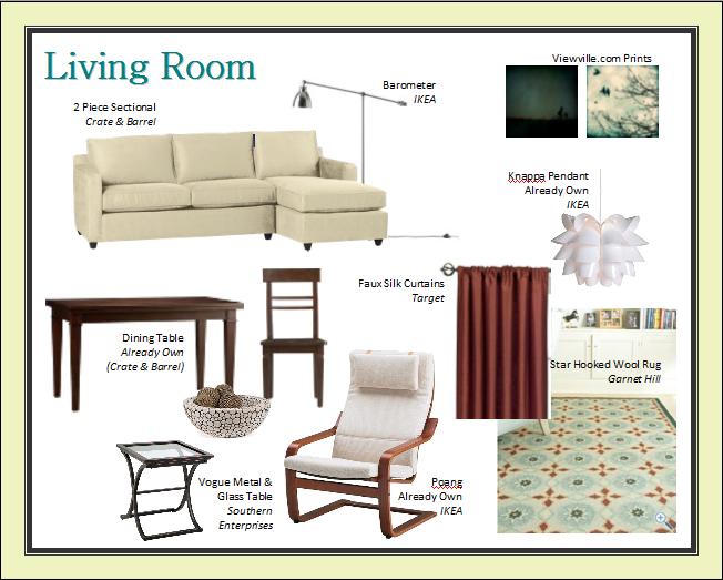
I tend to think that the main source of inspiration in the living room is the rug. My problem is…I can’t decide on one. I have gone back and forth and back and forth. Finally I have found what I call…”The One”. “The One” works with my current curtains (which I love) and the current paint color (which I love).
I put together this inspiration board (which I love). Sensing a theme?
Wes and I are still working on our dream couch but essentially the items on the board are either soon to be purchased or already in our possession. I love how the cool blues play with the rich, warm copper in the rug and curtains. Then with all the neutrals to calm the room, it’s just perfect for our eclectic and, often times, too dramatic family. I kept trying to incorporate too much color into our living room. Now don’t get me wrong, I love a little color but a lot of color can be just too overwhelming, especially in a small home like ours. Thats why this scheme works so well for us. The rug and curtains provide just enough power for the room and then everything else remains soothing and neutral.
So tell me…what floats your boat when it comes to living room decor? Are you bold and colorful or serene and neutral?
 The first thing I try to do before tackling any project (much to my husband’s dismay) is to create an inspiration board. This is a collage that helps me put all my decor thoughts in one place. By putting the color scheme and proposed products together, it helps me visualize the end result. It also makes it easier to narrow down all my ideas without visiting a ton of stores or returning a bunch of products once I realize they don’t work. Don’t get me wrong, we do a lot of that too but this helps cut down on that time tremendously. I create my inspiration boards in photoshop but you could use any program that allows you to copy and paste photos. I’ve even created some of my early boards in Microsoft Word.
This is the inspiration board created for the bathroom renovation:
This helped us see THE BIG PICTURE and not just focus on individual things we liked. This inspiration board really spiraled from our selection of shower wall tile. We were sold on white subway tile from day one. There was no debating on this. Wes and I both agreed it would be perfect and once we BOTH agree on something, you better roll with it because when it comes to home decor, the agreeing doesn’t always happen so easily (I love you, honey!). Once the subway tile was determined, I started the hunt for a floor tile. We entertained every option, from slate to marble and finally we settled on this. A chocolatey mosaic tile with a patina finish. As soon as I saw it, I fell in love. And then it got the Wes seal of approval so I was sold!
With the two main surfaces determined, I could really play around with the accent colors and art. We eventually settled on a slate blue and sage green hoping to energize the room a bit and tie it to the rest of the house. The master bedroom and guest bedrom play with blue and green tones so it only seem fitting. I’ve been in love with this Frank Lloyd Wright print of Falling Water for as long as I can remember and as soon as we settled on the blue and green accents, this little guy just seemed perfect. And “Falling Water”? I mean, if that isn’t perfect for a bathroom, I don’t know what is! Then I found an additional print at Etsy that incorporated the slate blue and a play on a famous saying I remember from many art history classes that seemed ideal for the bathroom as well. I guess I’m developing an architect theme in here for some reason.
Once the tile and color scheme were determined, everything else started to fall in place. From the extra long shower curtain (courtesy of Young House Love’s recommendation) to the recycled glass soap pump from Target, I was starting to see the whole vision come together. After all the pieces were in place, we took the DIY plunge and got to work!
Stay tuned for Seriously?! Chapter 2, Tiling the Shower!
While I’m compiling all the project details and pictures for our bathroom overhaul, I thought I’d share a little sneak peek of the joyous conversations Wes and I shared as we started each task. I call this “Seriously?!”
- ” They installed the shower wall tile right onto drywall! Seriously?!”
- “”They put the vinyl flooring right on top of the old vinyl flooring! And they only put glue in a big glob right in the center! Seriously?!”
- “They only replaced SOME of the rotten wood underneath the soaking wet window IN the shower! Seriously?!”
Yep, lots of stupidity was uncovered as we started ripping away the layers from the previous owners. Luckily, we have the satisfying feeling of knowing that our beautiful bathroom is now structurally sound and water proof! I can definitely sleep a little easier now, thats for sure.
Now here is a friendly reminder of the bathroom before our overhaul…

Stay tuned for Chapter 1!


